Biometric Health Assessment
Data-driven prevention and early intervention strategies through clinical-like health assessments using a smartphone.
Data-driven prevention and early intervention strategies through clinical-like health assessments using a smartphone.
Product type: White label app, B2B SaaS
Industry: Healthcare
Work involved
• I worked across multiple teams: Innovation Labs (Data Science, Machine Learning, Computer Vision), QA and Engineering, Customer Success.
• UX/UI, market research, user testing, documentation, video tutorials,
Company
Advanced Health Intelligence
Resources
The Biometric Health Assessment (BHA) is a clinical-like health assessment consisting of multiple assessment stages. It is designed to assist clinicians or other upstream services in combined health risk analysis. The assessment is conducted using your smartphone at home and using household objects.
The assessment stages are:
❶ Mental Health: Depression (PHQ-9), Anxiety (GAD-7) Questionnaires
❷ Cardiovascular Health (FaceScan)
❸ Body Analysis (BodyScan)
❹ Health at Rest (FingerScan)
❺ Fitness Evaluation (FingerScan)
AHI Promo Video
As you progress through each stage, your health data is used in a model that predicts potential risk for chronic diseases and predict other biometric markers.
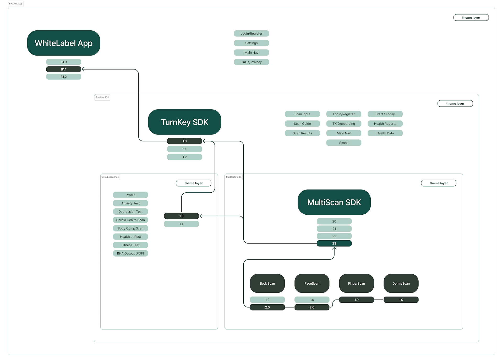
BHA is a turnkey SDK solution that is embedded inside a partner’s app for iOS and Android. It essentially serves as a health portal to conduct health assessments and integrate with other clinical ecosystems.
A white label app was created for partners who do not have an app of their own and acts as the primary demo.
The integration is semi-flexible, depending on a partner’s needs. Partners can enable or disable scan modules to suit their desired outcomes. By default, the mental health modules are disabled, so moving forward, I will refer to the four main stages starting with Cardiovascular Health.
BHA SDK Integration
The TurnkeySDK is integrated inside a partner app, which in turn consumes the SDK containing the proprietary scan technology.
The BHA was an evolution of a previous combined health assessment initiative called CompleteScan (also CompleteHealth). I was involved in creating the entire app, which included the design, prototype, results, use cases, promotional video, decks, and partner documentation.
CompleteScan Promo Video
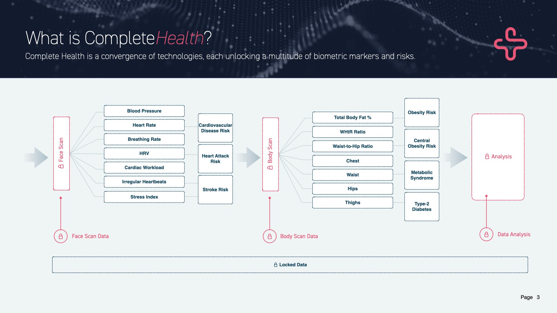
Combining Biometric Data
Slide from the CompleteScan presentation.
The concept of the BHA, while not new, distinguished itself through the use of a more advanced risk prediction model and the support of a dedicated team. This project gained official status with the acquisition of two companies, WellteQ in Singapore and Vertica Health in South Africa, in 2023.
In 2019, a Singaporean company named Body Composition Technologies (BCT) was established. They licensed BodyScan technology for data collection and to predict body composition in the life and health insurance markets.
In addition to producing the standard marketing materials, I was responsible for creating and managing the complete workflow from data collection to app integration for this partner company.
This responsibility was slightly different from the digital health strategies AHI was implementing through licensing agreements, both ventures were centered on one crucial data point: Total Body Fat.
BCT had established data collection points at numerous medical and educational institutions around the world, complete with DEXA machines and ISAK-certified staff, to collect the baseline truth essential for training our ML models.
My work involved close collaboration with research staff to expand the biometric data points necessary for the health and insurance sectors, in addition to supporting AHI's market needs.
BCT: Life and Health Insurance
BCT was focused around body composition, specifically body fat percentage. I created the video, script, decks, app demo, etc around 2019.
Flutter is being used as the dev framework, which inherently means using Material. FlutterFlow was also being utilized for some design production. This expedited the development of our Minimum Viable Product (MVP), which I aptly renamed to Minimum Viable Demo (MVD) due to its preliminary nature. Unfortunately, this meant the MVD began with an already outdated UI base (M2 instead of M3), which persisted through updates over the following months.
Looking ahead, version 2 (V2) of the BHA will transition to Material 3 once Flutter fully supports it.
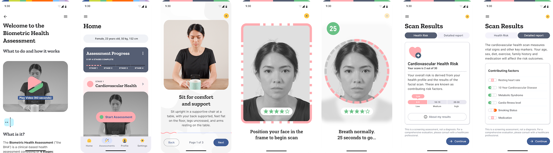
BHA release 1.0 “MVD”
The BHA includes traditional app components to inform, remind, and track progress throughout the assessment. It has the following supporting sections:
Onboarding
This section is targeted at new users who do not know what the BHA is. The onboarding will explain what the BHA is, provide an indication of the time it takes to complete it, and explain the outcome.
Home
The main landing page for all users. Cards and triggers will show depending on the user status:
⁍ New/existing users without assessments
⁍ New/existing users with assessments
⁍ New/existing users with in-progress assessments
It will serve actions, notifications, and other messaging to encourage progress and understanding of what to do now, what to do next, and what they can get out of it.
Assessment Home
Like the home page, the assessment home section is primarily responsible for informing users what they need to do, what is involved, how long it takes, and what data they will see when complete.
Help & Support
A section dedicated to informing a person about the BHA and its stages. It will go into detail on how each stage works, why they should be doing it, how the technology works, what happens if they do not follow the guides, and general FAQs.
Profile & Settings
An important page that holds the biometric data that is entered as part of the app or assessment onboarding. It is important to keep it scientific and 'matter of fact' when identifying their important biological information such as height, weight, gender, ethnicity, family history, activity level, and diet.
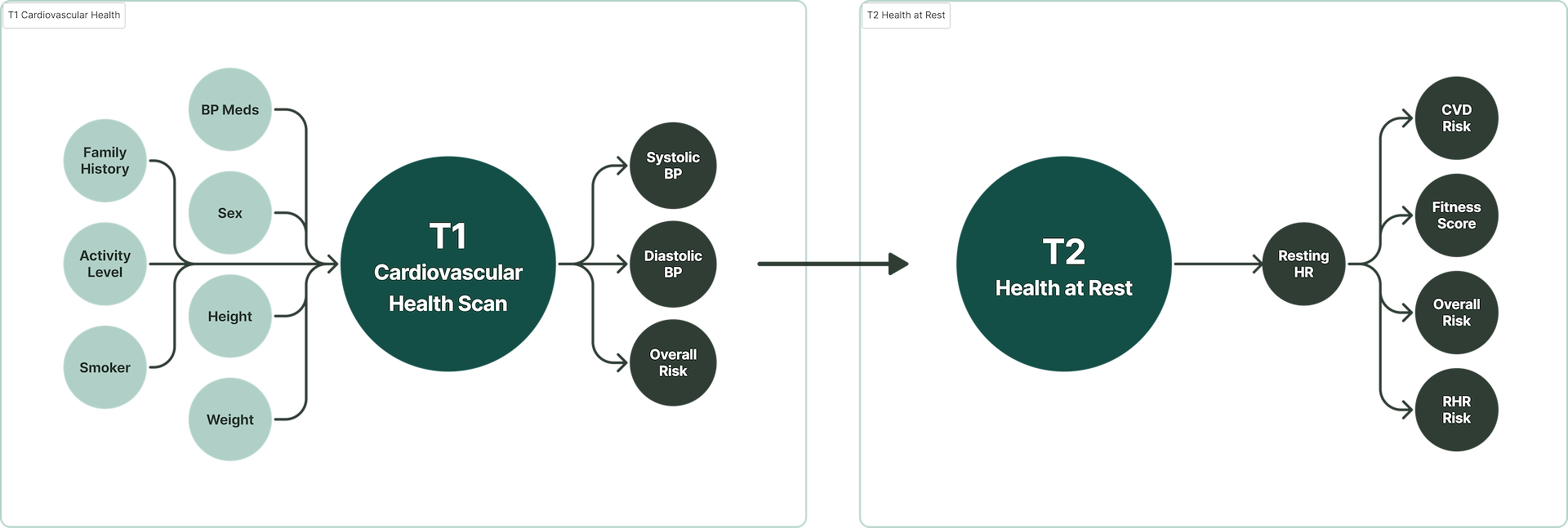
A complex, multi-stage algorithm (model) takes the data from each completed stage, which then feeds into the next stage to calculate its values. Each stage predicts more data, which in turn predicts more data. The calculations use information from vetted published medical papers. The scans themselves and the questionnaires are just methods of biometric capture, and the risk categorization becomes the most valuable asset.
Each stage generates its own biometric data and health risks. For example, the first stage consists of a Cardiovascular Health Scan. This gives us risks for Cardiovascular Disease (CVD), Heart Attack, and Stroke (just to name a few; more on that later). These can be shown to the person as an incentive to “unlock” the body the more they progress. The low barrier to entry of a FaceScan builds trust and encourages progression through the following stages.
Part of the BHA Model
Data from each scan is connected and passed on to subsequent scans, and then recalculating values as more biometric data is available.
While the BHA sounds like a smart solution that, at first glance, is achievable in today’s AI-driven world, the challenges it faces to being market ready are substantial. It is very green in terms of market fit and features that a large enterprise or government body requires. In cross-functional teams, these items are addressed.
Apart from usability issues, FDA approval, medical due diligence, standards and policy compliance, international data interoperability, language support, theming and customization, and data analytics and support infrastructure would all need to be completed prior to contract signing and partners being able to use the SDKs.
Each stage is comprised of a scan and some physical actions that need to be performed, each with their own difficulties. If there has not been enough development into making the scan easy to use, the drop-off point and negative perception of the technology will remain high.
Despite providing a contextual incentive, such as receiving a prescription renewal or serious medical related information, a person will hate using the technology and respond negatively over time when asked to perform an assessment.
Per-stage User Friction Score (UFS)
I used a combined index to ascertain the overall friction of the assessment. This was done by allocating an interactive and cognitive friction score to each stage. This was based on internal and existing feedback randomized user testing.
The score and its corresponding weight were used to calculate the total score. The weights were adjusted over time to reflect changing user feedback. It was important to start putting values against actions and looking at the assessment in various ways to communicate with other departments on task priority.
The average reported friction score was calculated (out of 10):
❶ Cardiovascular Health Scan: 4
❷ Health at Rest: 4
❸ Body Analysis: 7
❹ Fitness Evaluation: 10
Each score is out of 10, with a higher score being more difficult. The assessment friction score was 25/40. The drop-off (under likely conditions) would occur at stage 3, usually after 1 attempt and most likely at 4.
I would need to have some compelling triggers and helpful information to provide the incentive needed for someone to complete Stage 3 and even more so for Stage 4.
The friction points were numerous and quite large to cover here. I have written more extensively in the Body Analysis update project, which involved initial baseline user testing to address its specific needs.
Notification & Message Fatigue
The solution is embedded into a partner app. As such, we do not have full control over notifications and reminders. We can only control what happens when a person visits the health portal. The answer was to provide API endpoints so that partners could build in various offline and online messaging to encourage the completion of the assessment. The problem arises that if a partner already has optimized their app to reduce notification fatigue, adding the health portal will upset this balance and inundate the user, leading to them turning off notifications entirely.
Email updates are still a potent trigger for certain app users. People are used to using multiple platforms or apps in their daily lives. The BHA embedded in a partner app would be difficult to elevate without the proper messaging.
Partners were encouraged to have a trigger-based email system and set calendar reminders of their next assessment, plus provide access to help and consummation of information on health and the scans themselves to help deal with assessment atrophy and fatigue.
It was clear that the need for finer control of notifications was needed. A planned feature was to expose this control to the person inside the Settings section.
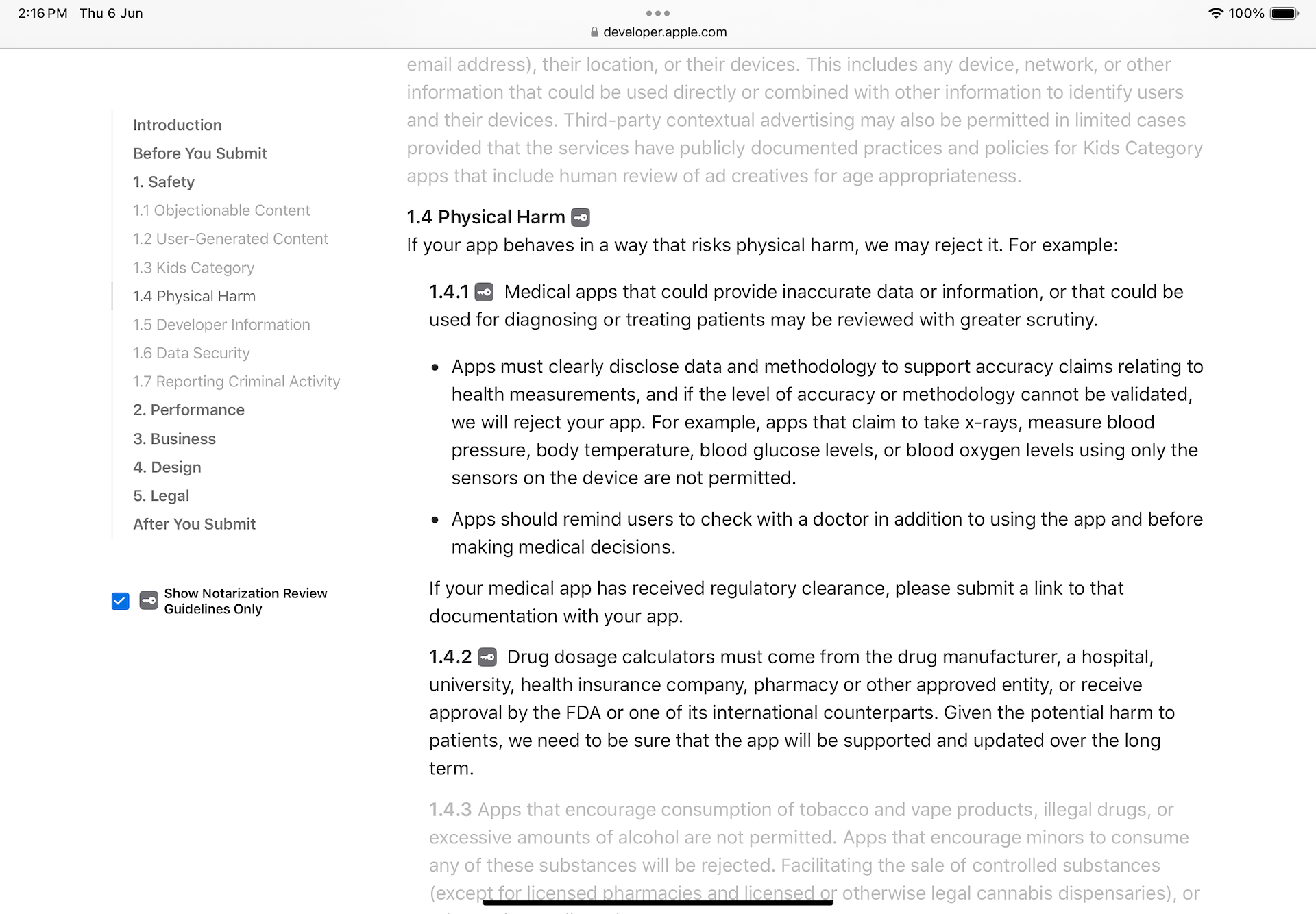
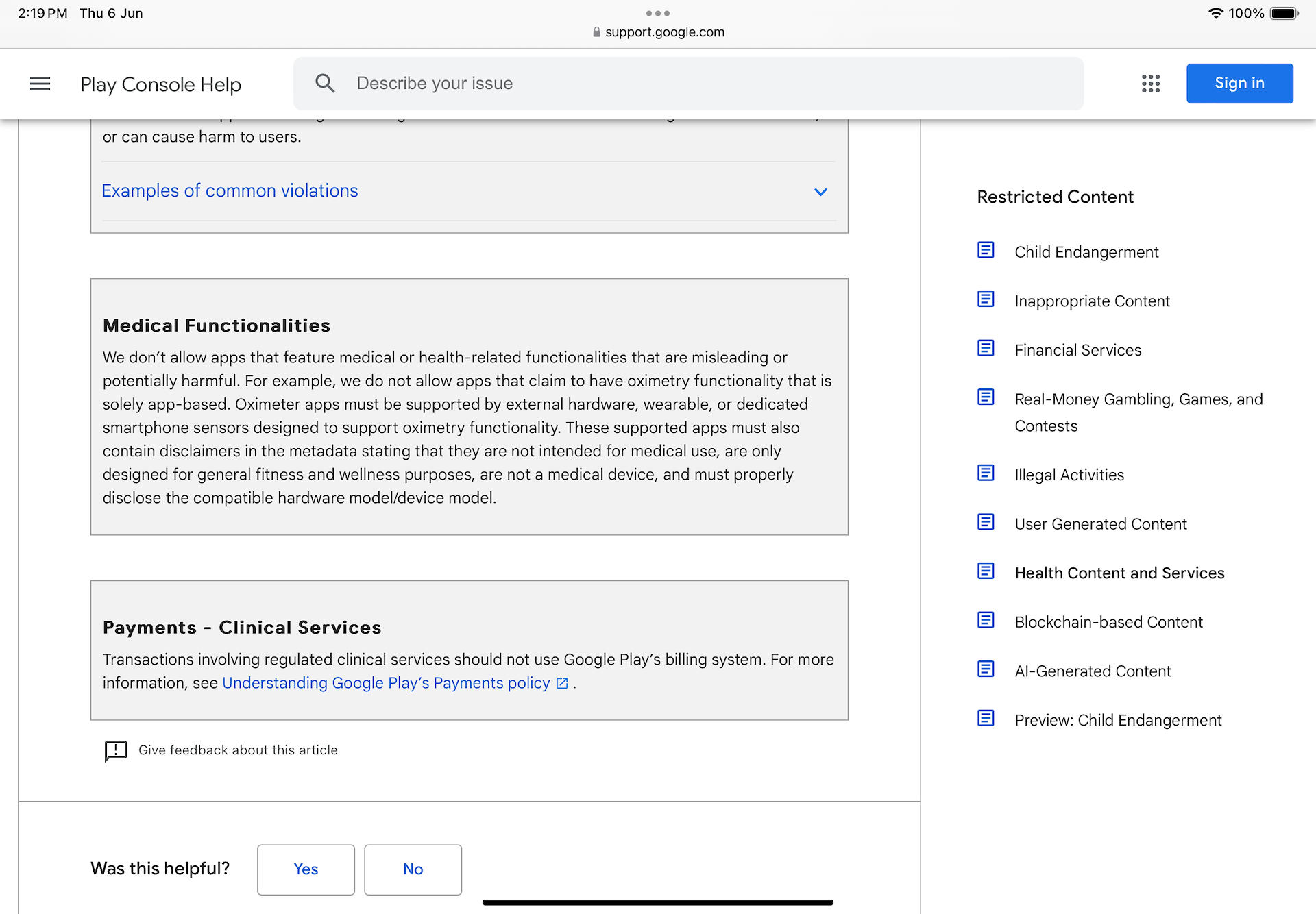
App Store Guidelines
Google and Apple have strict guidelines around the display of medical data, and the use of the phone as a medical device. Although apps exist on some of the app stores, they risk being removed, and any new apps going for approval will likely not be approved. As the technology is embedded into partner apps via SDK, it is a high-risk scenario that their app will get removed or rejected. Conforming to strict guidelines is a continuous process that requires a dedicated approval process and timeline.
Rather than displaying systolic and diastolic readings and using the term 'high blood pressure,' I chose to present the interpreted risk of hypertension (and hypotension). This approach may not be foolproof in the long term but it remains effective in the approval process.
Apple App Store Guidelines
I chose a standards-based design approach centered around FHIR / SDS guidelines using Google's Open Health Stack. This approach will add a layer of uniformity to the visual design, interaction, and consistency in input gathering, as it is an industry-standard for various purposes, including:
⁍ Past medical history (PMH)
⁍ Family diseases
⁍ Social history
⁍ Research questionnaires/Clinical research forms (CRFs)
⁍ Quality and evaluation forms
⁍ Patient intake form (e.g. clipboard)
⁍ Forms to support insurance claims
While a standards-based approach will introduce a rigid framework in implementation, it will also allow for adaptation in emerging technologies (such as capture), where the rules are not yet defined. This adaptation should be heavily based on papers in HCI, ensuring that the study and UX have scientific backing.
The focus should not be on reimagining UI components, but on using function as the main driver when approaching the outcomes. Illustrations and theming will provide enough customization to meet most partners needs.
The preference is to have someone complete the whole assessment in a single session. This might also depend on a partner's needs, but by default, I wanted to reduce drop-off while retaining accuracy. In doing so, they will need to plan ahead and allocate the time, which can be upwards of 30 minutes.
For new users, despite having all the information on how to prepare, what they need, and the time required, they will be met with obstacles that force them to stop and continue another time. It's a bit like reluctantly doing the dishes and realizing you forgot some pots and pans but put it off until the morning.
My approach is to recommend (and frame) ways to complete the BHA so a person can set and control their outcomes. The idea was to implant the possible paths (power of suggestion) they should follow without forcing them to a particular path:
❶ Single session: This will take about 30-40 minutes. If they decide to stop and continue later, they will fall into path 2.
❷ Split over several days: They can complete it at their own pace but recommend 1-3 days.
Neither of these is enforced by the UI, which means they are not forced to choose a path. We just explain that it's up to them and set some boundaries (perhaps up to 3 days). The notifications system would act as a reminder and possibly be a calendar of “Next steps” they should be planning for.
Stage 4: Fitness Evaluation – Exemption
The Fitness Evaluation stage poses risks by requesting physically intensive exercises from those with health conditions. To mitigate this, a PAR-Q+ (Physical Activity Readiness Questionnaire) is administered first. This seven-question screen identifies readiness through self-reported responses. If any question is answered Yes, the user can skip the Fitness Evaluation.
Where a clinician has indicated that they are unfit for physical exercise, it is recorded as high-risk. The calculations use a fallback fitness score based on Stage 2 (Health at Rest) for other calculations, and the model is run.
Stage 4: Fitness Evaluation – Smarter Exemption
The current PAR-Q placement sets incorrect expectations by indicating 4 assessment stages initially. In reality, unfit users complete only 3.
If we determine their physical readiness based on some leading questions during the BHA portal onboarding, we can dynamically ask a few more leading questions. A decision tree can guide them through the process, and with a closer look at duplicate or near-similar questions around medication, they can be combined into an optimal flow.
We would need to research the top 3 "Yes" answers for the PAR-Q and work them in before starting an assessment. The messaging will then be clear that users need to complete only 3 stages, a ⅓ ratio which is magical in its effect of reducing the perception of time and expectation of effort.
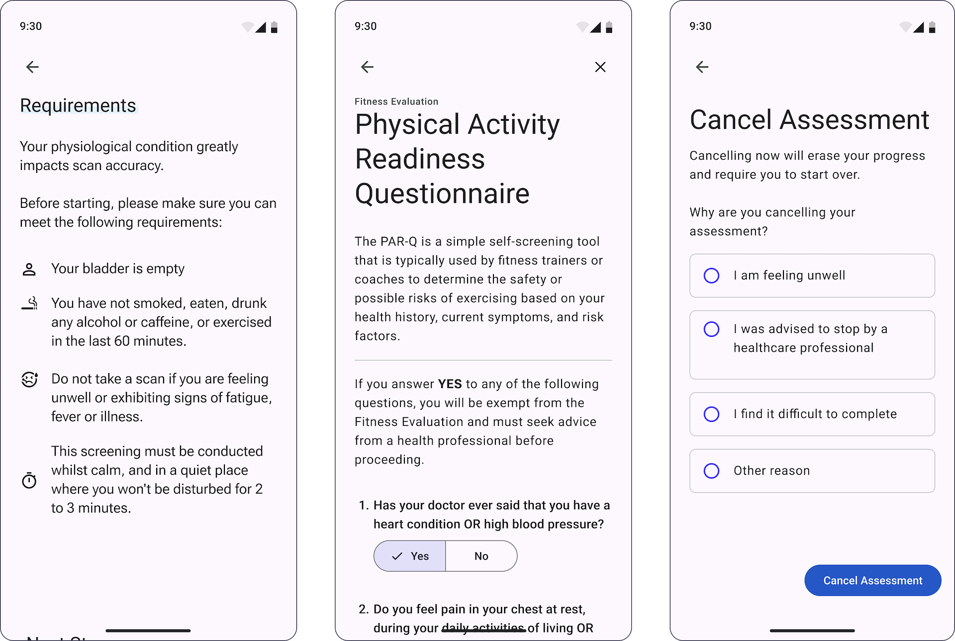
A person should be given the option to cancel for any reason, but we would like to know the reason. There are valid reasons why a person might quit, and they are outlined throughout the use of the BHA and before starting each stage.
Example assessment cancellation screens
Each stage has a reminder of some basic requirements, along with anything specific that is needed.
The center screen shows the PAR-Q+ questionnaire, which is required prior to starting stage 4.
Considerations for the natural timeout are important, but physiological conditions have been indicated (by resident clinicians) as not influential on the results. However, the longer the time, the greater the chance of being sick, having an injury, or other external factors that may cause the test to be manually canceled.
A canceled assessment is not entirely wasted. The data snapshot is still useful to upstream providers and teams such as customer success and, naturally, product. Any entered values are saved in the system and are visible and viewable as ‘canceled’ in the home section. When starting a new BHA, some fields will pre-populate, reducing the time and effort required for subsequent assessments.
A strong influence for the timing is from the book Designing and Engineering Time by Dr Steven Seow. I tend to use citations in my product docs to validate decision-making and adapt to the great work conducted throughout the book.
Polite and Precise: Tone & Messaging
Several aspects will help control the outcomes of the BHA from the perspective of the person using it. An important element is to get the tone and messaging right. They cannot see the BHA as a toy. It needs to be treated seriously, and they need to follow the instructions. It is built on real science and relies on their participation.
Much like going into a doctor's office, when a person sits down, and the doctor is doing an examination, the doctor will be very clear:
"Lift your arm,"
"Does it hurt here," etc.
The patient does not hesitate to accommodate their needs. We want something similar, but we are faced with the relationship a person has with their device. It is an entertainment and communication tool, so this bias will influence our intentions. They may also have a bad and distracting relationship with their device, spending hours on social media and doom scrolling vast quantities of content.
Speaking in technical terms and providing helpful explanations is a key aspect of winning them over and getting them into a frame of mind. If the content is trivialized and over-friendly, they will not take it seriously.
But we do not want to fear-monger about medical conditions; we need to be neutral and "matter of fact" about it. Although partners can localize strings, our default should cover our refined approach.
If accomplished, they will slow down and begin to read the content more carefully. Once you have them there, you do not want to start displaying walls of text either. Short and precise sentences are designed to not waste their time and assert the requirements and the need for their help in completing the assessment.
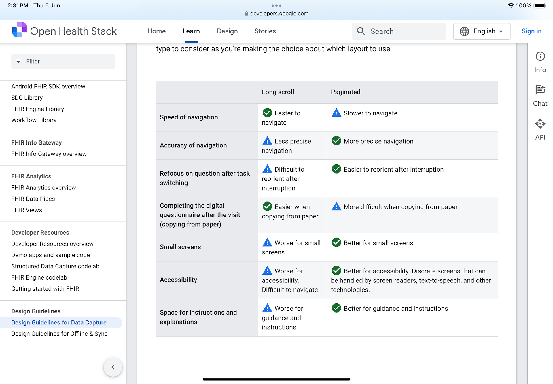
Long Scroll & Paginated Layouts
Screen layouts can be used wisely to break content of importance up into pieces for slower ingestion or on a single screen for improved speed. The Open Health Stack (OHS) Design Guidelines for Data Capture provides a table to help decide what layout to use.
My approach is to mix and match and adjust where the guidelines fall short… If something is important but they only need to do it once (like the Health Profile), we slow them down. We're in an education phase; this is about them; it must be correct; we explain why; we ask them to confirm.
Open Health Stack (OHS) Design Guidelines
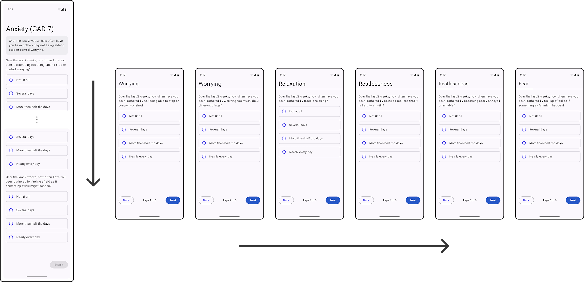
In practice, the mental health questionnaires are a direct use case for the guidelines. Here you can see a long flow of questions versus individual screens.
The guidelines only give a UX perspective to the arrangement of Material (or any UI) components. What they fail to outline is the sensitive nature of what is being asked. The general rules, as they apply to the BHA, are that when you are conducting any of the assessment stages, the speed is adjusted:
❶ Slow: It is my first time, and I need extra guidance.
❷ Normal: It is my second+ time, and I am familiar with the process.
Development was being focused in other areas (mainly in validation models) so a large portion of the work entered a backlog.
Some pressing projects that I had already worked on also needed to be addressed:
⇢ Body Analysis (and all other scans) needed UX Testing (and test apps).
⇢ Cardiovascular Health Scan needed to be changed to use the new recommended guidelines, then fully tested.
⇢ Implement the UCDL so all capture UI was unified.